

.png)
Scroll through a brand's feed that's actually nailed its look, and you'll notice something before you notice anything specific. The colours feel related. The lighting doesn't jump around. Every image seems to belong to the same universe, even if the subjects are completely different. That's a visual style, and it's harder to hold onto than most people expect. An AI image generator can actually make this easier, not harder, once you know how to steer it. Dreamina, running on its latest model Seedream 5.0 Pro, is built with exactly this kind of repeatable output in mind.
Why style consistency is harder than it looks
Anyone can make one good image. Making the tenth one look like it came from the same photographer, same day, same mood, is where things fall apart. Lighting drifts warmer. A background colour shifts a shade. Small differences pile up fast, and by image number twenty, the set feels disjointed even though no single photo looks bad on its own. Style consistency isn't about perfection in any one shot. It's about restraint across all of them.
The core elements that define a visual style
Before generating anything, pin down what actually makes your style recognisable. A few things usually carry the most weight:
Colour grading and overall palette
Lighting quality, soft versus hard, warm versus cool
Composition habits, like centred subjects or consistent negative space
Write these down somewhere. Vague ideas about "clean and modern" fall apart the moment you're generating your fifteenth image and can't remember what "clean" meant three photos ago.
Meet Dreamina's Seedream 5.0 Pro
Seedream 5.0 Pro is genuinely well-suited to holding a style together across dozens of outputs. Its precision editing tools-point selection, lasso, and sketch guidance-let you nudge one image closer to another without rebuilding it from scratch. Layer separation matters a lot here too, since it lets you isolate and match lighting or background elements independently rather than adjusting a flattened image and hoping for the best. Add 2K resolution for detail that holds up at scale, native text generation across 14 languages for consistent branding in multiple markets, and built-in research that keeps visuals current, and you've got a model built for sets, not just standalone images.
Turning one style reference into a repeatable system
This is where the process actually clicks into place. Below is how it plays out inside Dreamina.
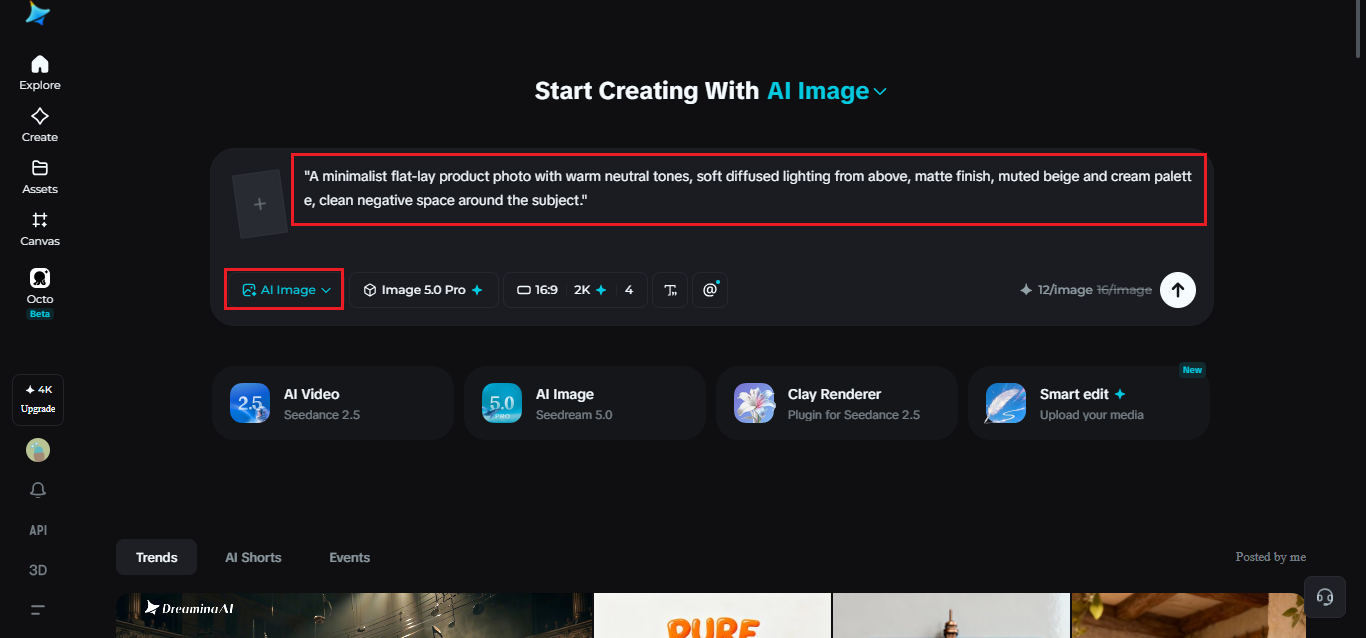
Step 1: Write a text prompt and/or add a reference image
Go to Dreamina and write out your prompt with real specificity: tone, lighting, palette, mood, all spelt out rather than implied. Upload a reference image of your target style so future generations have something concrete to match.
A workable prompt might read: "A minimalist flat-lay product photo with warm neutral tones, soft diffused lighting from above, matte finish, muted beige and cream palette, clean negative space around the subject."
Step 2: Adjust parameters and generate
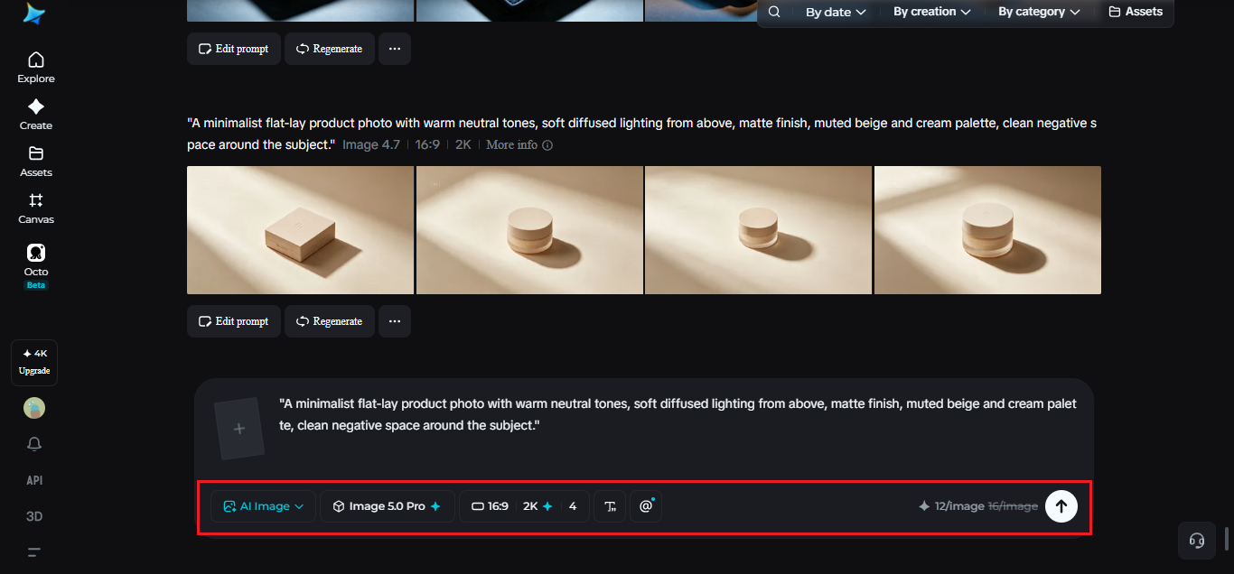
Choose Image 5.0 Pro by Seedream 5.0 Pro as your model. Set aspect ratio and size to match your platform, and pick resolution based on the need: 1K works fine for testing a style direction, 2K for anything going live. Once everything's locked in, click Dreamina's icon to generate.
Step 3: Customize and download
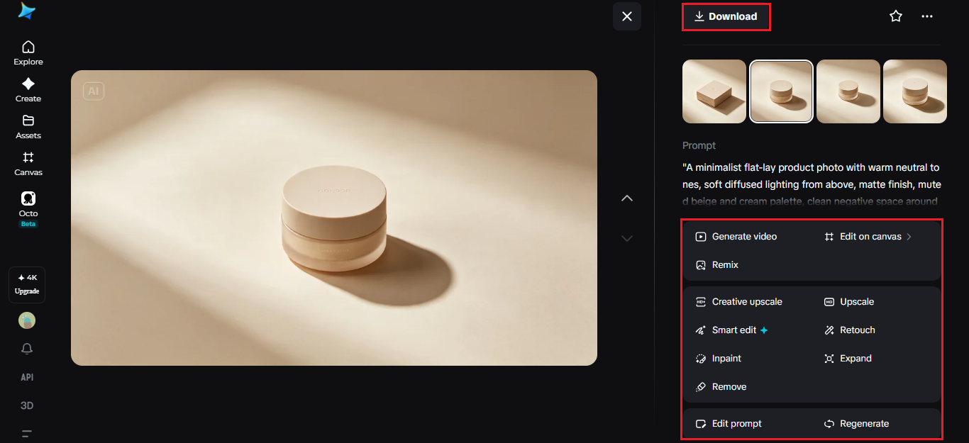
The first output rarely nails everything perfectly, and that's normal. Use inpaint, expand, remove, and retouch to bring stray elements back in line with your established style, whether that's fixing a shadow or adjusting a color that drifted slightly off. Once it matches, hit "Download" and move to the next image in your set.
Keeping the style locked across a large batch
The real test isn't image five. It's image fifty. A few habits help keep drift from creeping in:
Reuse the same reference image across every generation in the set
Save your winning prompt as a template and only swap the subject
Spot-check every tenth image against the very first one
Small, consistent checkpoints catch drift before it compounds into a mismatched catalog.
Signs your style is starting to slip
A few tells show up before a set feels obviously inconsistent:
Shadows grow sharper or softer than earlier images.
Backgrounds shift a shade warmer or cooler over time.
Compositions gradually drifting from centered to off-balance
Catching these early is far easier than trying to fix twenty finished images after the fact.
Where a consistent style pays off most
A locked-in visual identity tends to matter most in certain places:
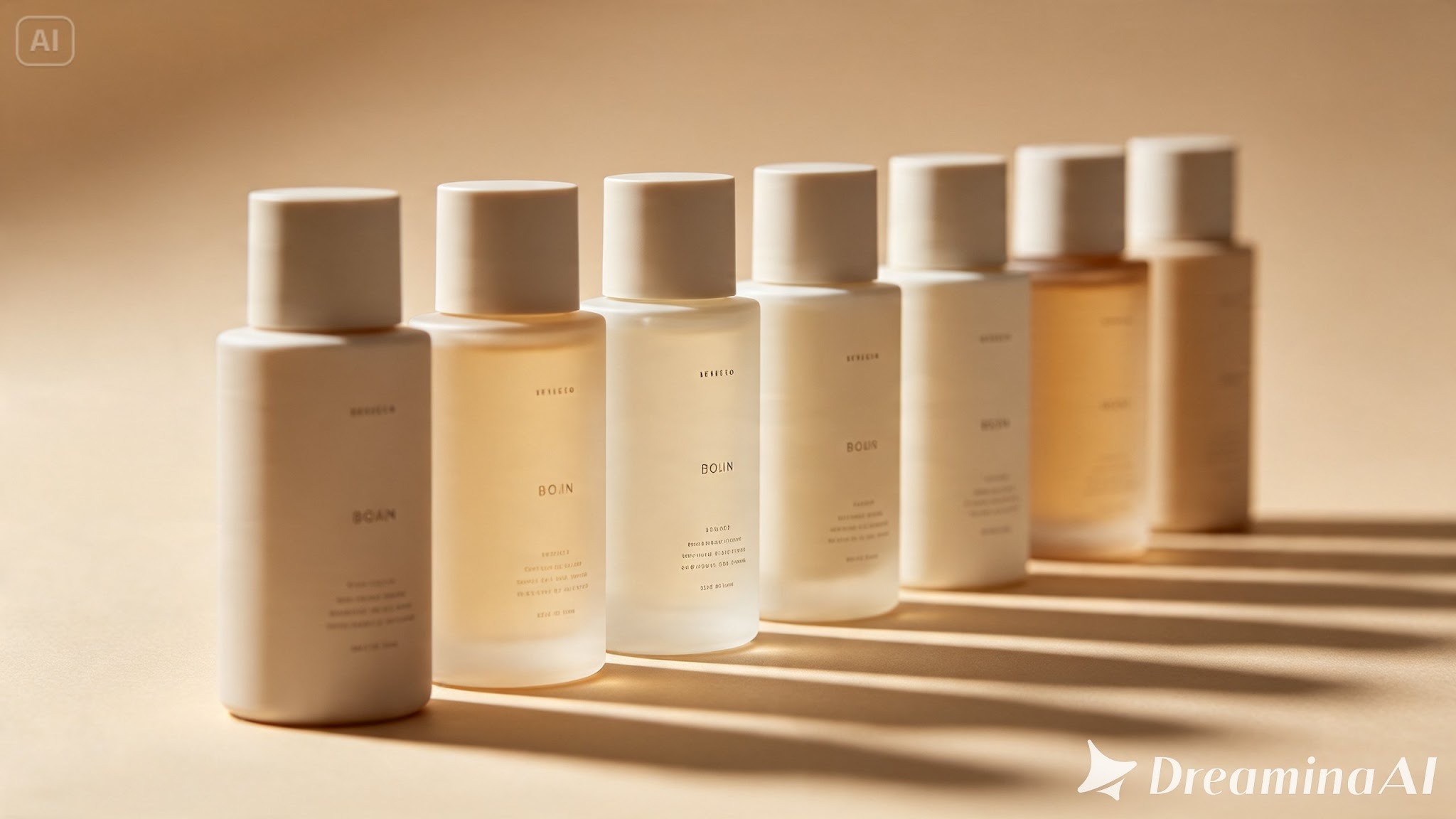
Brand catalogues where every product needs to feel related
Social feeds where scroll-stopping cohesion builds recognition
Multi-market campaigns needing the same look translated across regions
Anywhere volume matters, consistency is what keeps that volume from looking chaotic.
Wrapping up
A recognisable visual style isn't luck or a single lucky shoot; it's discipline applied across every image in a set. With Dreamina and Seedream 5.0 Pro, that discipline comes down to a strong reference, a precise prompt, and a habit of checking your work against where you started. Get that right, and a hundred images start looking like they all came from the same place. Because, in a sense, they did.
.png)